Firefox for Linux always seems to ship with the crappiest possible font configuration. Why? This is what the fonts look like by default on a fresh install of Firefox 1.5, and also in Ubuntu's unreleased "Dapper" distribution's current 1.5 package.

Now, here is the same text rendered using fonts that are packaged with the distribution, and in fact, almost all Linux distributions these days:

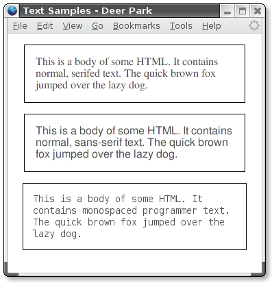
"FreeMono", "FreeSans", and "monospace". Was that really so hard?
3 comments:
The FreeMono and FreeSans examples seem to alias badly on my LCD monitor...
But yes, hell yes, this bugs me too
ever since netscape 4. :(
Terrible browser fonts remind me of archzoom. Can you read this? At all? because with the set of fonts I have in Etch, it's like trying to read through glasses which have been attacked with a stiff wire brush.
Fonts have always been a personal bugbear of mine - when you're spending many hours a day staring at a screen, it makes a huge difference. I was (until very recently) using the bitstream vera family, but Autrijus put me onto the new MS Windows Vista fonts. Candara and Consolas are both very nice.
Post a Comment